
Sector
Creative Portfolio
Location
Italy
Date
Oct 3, 2024
Overview:
Project Overview
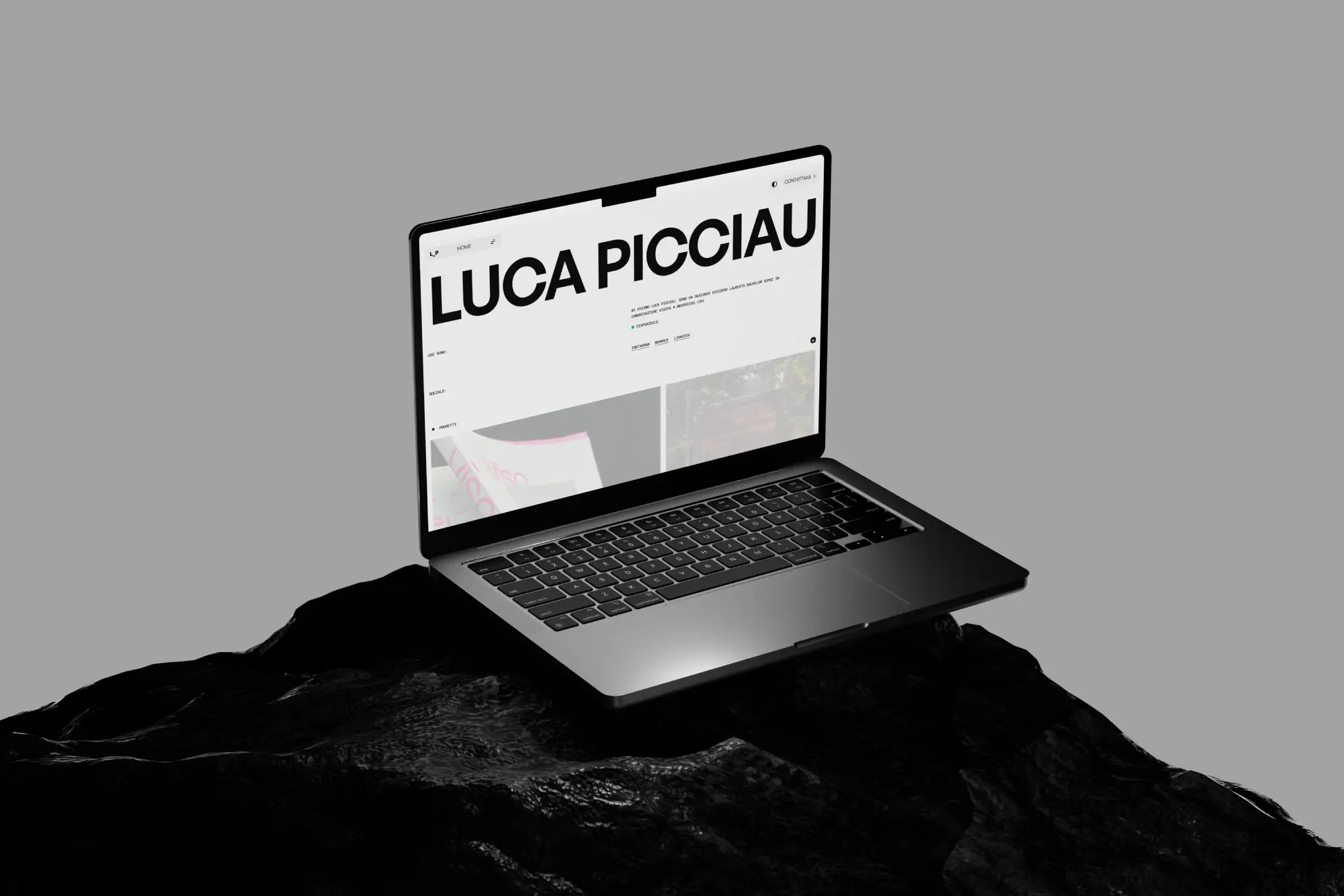
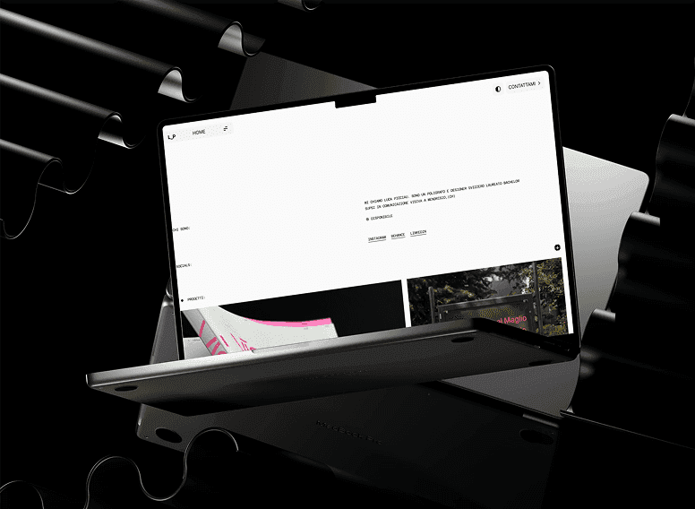
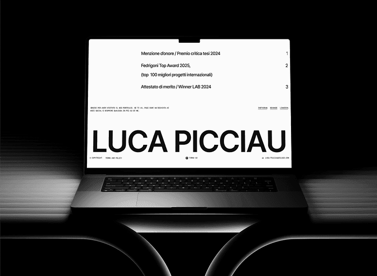
Luca Picciau is a multidisciplinary visual designer whose work spans branding, editorial design, and visual communication. The goal was to create a portfolio that places the creative work at the center while maintaining a minimal interface that feels refined, elegant, and easy to explore.
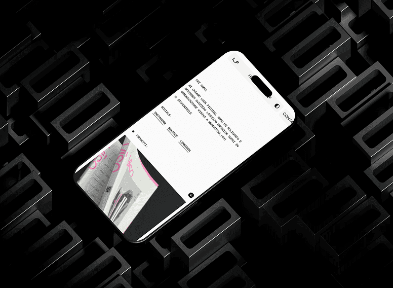
I transformed the approved design into a fully responsive Framer website with smooth interactions, reusable components, and consistent layouts across all devices.
The Challenge
Unlike traditional business websites, a designer's portfolio must let the work become the primary focus while still delivering a polished browsing experience.
Key challenges included:
Creating a clean and distraction-free interface.
Preserving strong visual hierarchy through typography.
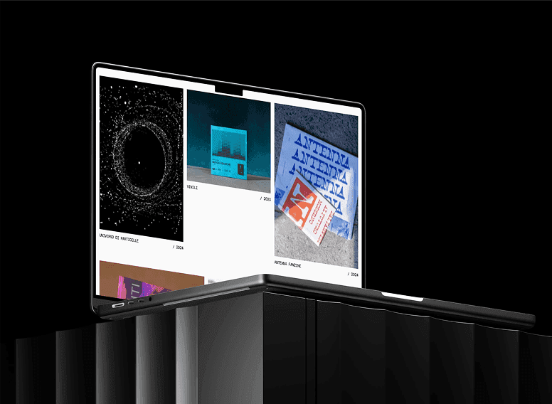
Displaying projects with consistent spacing and rhythm.
Maintaining responsiveness across varying image sizes.
Building flexible layouts for future portfolio updates.
Project Goals
Showcase creative work with clarity.
Create a premium minimalist experience.
Build a scalable portfolio structure.
Ensure seamless responsiveness.
Maintain strong visual hierarchy.
Support effortless project exploration.
My Role
I handled the complete Framer development process, including:
Responsive website development
Component-based layouts
Portfolio grid implementation
Smooth page interactions
Performance optimization
Cross-device testing
Pixel-perfect development
Development Highlights
The website was built with simplicity and flexibility in mind.
Highlights include:
Fully responsive layouts
Modular Framer components
Optimized portfolio grid
Smooth page transitions
Performance-focused development
Consistent spacing system
Pixel-perfect implementation
Key Features
✓ Minimal Portfolio Design
✓ Responsive Grid Layout
✓ Framer Development
✓ Smooth Page Transitions
✓ Typography-First Interface
✓ Modular Components
✓ Image-Optimized Gallery
✓ Performance Optimized
Design Approach
The design philosophy was centered around restraint.
Rather than relying on heavy animations or decorative elements, the experience uses typography, whitespace, and balanced layouts to direct attention toward the creative work itself.
Every interaction was designed to feel subtle, allowing visitors to browse projects naturally without unnecessary distractions.
Responsive Experience
Every page was optimized for desktop, tablet, and mobile devices.
Special attention was given to:
Portfolio grid behavior
Image scaling
Typography responsiveness
Navigation
White space consistency
Smooth browsing experience
Technologies Used
Framer
Responsive Development
Component System
Auto Layout
Performance Optimization
Interactive Transitions
Result
The final website delivers a refined and highly responsive portfolio experience that showcases Luca's creative work through clean layouts, thoughtful typography, and an intuitive browsing journey while remaining easy to maintain and expand.